
When it comes to designing a black kitchen, choosing durable, anti-fingerprint surfaces is key for functionality and longevity, while subtle variations in colour can add a soft layer of texture and light. Annika Rowson, director of Rowson Kitchens, designed this black kitchen for a coastal New Zealand home, selecting hardwearing materials that fit the modest budget of a young couple who love to entertain.
Located in New Plymouth on the west coast of New Zealand, the couple enjoys spectacular views of the coast and mountains through large picture windows. Their brief asked for a dark and moody kitchen, and a practical, timeless and elegant space where they can comfortably host family and friends.
Choosing the benchtop provided the starting point for the design, as Annika needed a robust and resilient black surface, which isn’t always easy to find. Silestone and Dekton are two of Annika’s all-round favourite benchtops, particularly when it comes to specifying black. She selected Silestone Doradus (2-centimetres thickness) to fit the brief for dark and moody and to provide a durable, no-maintenance surface.
“I always put priority on the benchtop as it’s the surface used most in a kitchen and it needs to be durable and hardwearing,” Annika says. To meet a tighter budget, the designer specified a thinner benchtop so as not to compromise on the desired product or material. “A thicker benchtop and mitred edge add more labour and cost. Thinner benchtops, around 1.2 to 2 centimetres thick, are more cost-effective,” Annika explains.
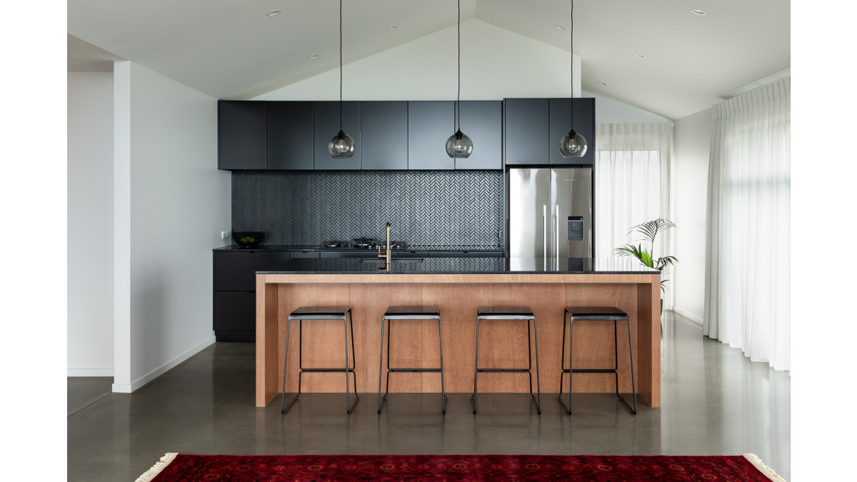
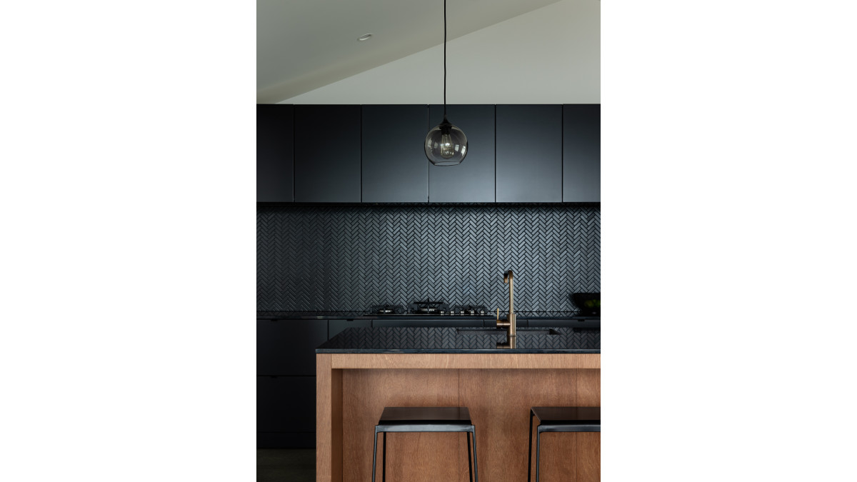
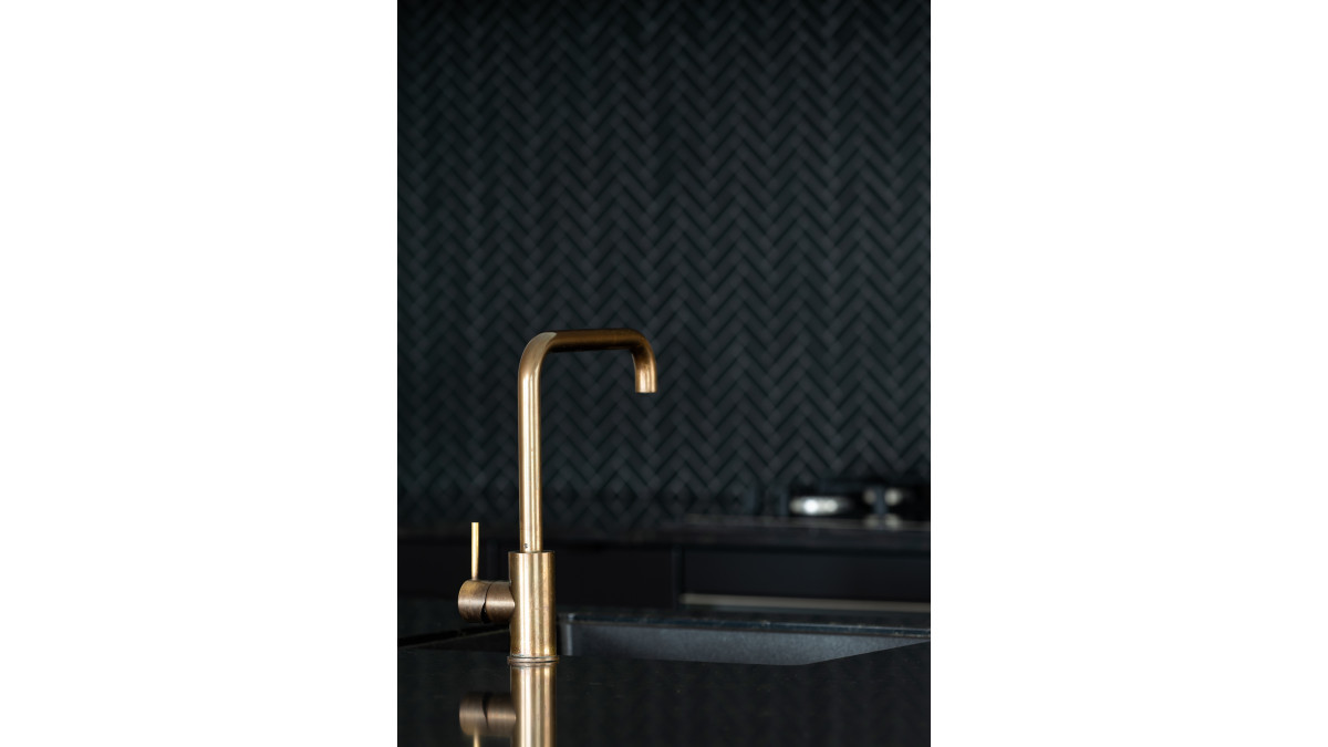
She initially specified Silestone Arden Blue, but Silestone Doradus proved to be the perfect choice as the design evolved. Its golden flecks complement the brass tapware and Keruing timber island, which introduce natural warmth and texture while still offering beautiful, durable materials. “Part of the joy of the design process is that it can evolve from what you originally start with as the palette develops,” Annika says.
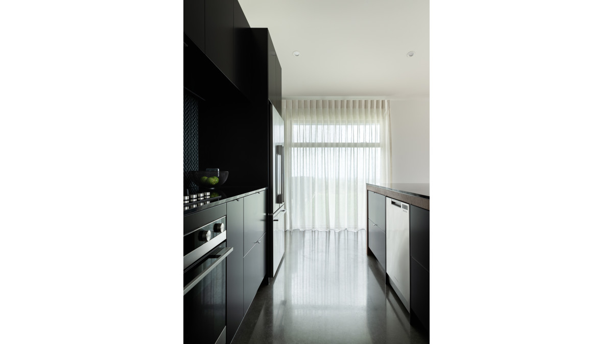
The simple galley-style layout of the kitchen provides lots of bench and storage space. The kitchen island has a large benchtop for food preparation, and the integrated sink makes it easy for the couple to be sociable with guests as they cook and entertain. There is also plenty of bench space to either side of the hob along the back wall, and overhead and under-bench cupboards and drawers provide easily accessible storage.
The black cabinetry is a thermoformed laminate with an anti-fingerprint finish to keep the kitchen looking pristine. “Surfaces in a black kitchen will accumulate fingerprints over time — especially if it has push-to-open cabinetry — so it’s important to choose materials that can withstand fingerprints,” Annika explains. “A matt black anti-fingerprint finish typically adds more cost, so we chose the best black product to suit the budget and to deliver a dark, moody wall.”
The herringbone-tile splashback adds subtle texture and pattern, and has a soft shimmer when illuminated by LED strip lighting beneath the overhead cupboards. Sheer linen curtains also add a touch of luxe and softness to the black-on-black kitchen.
The material palette continues in the scullery behind the kitchen, with Silestone Doradus benchtops, herringbone tile splashback, black cabinetry and open timber shelving for cohesiveness. “Some might opt for laminate in the scullery to reduce costs, but the thinner benchtops and timber shelving kept it to budget,” Annika says.
With thoughtful design and careful material specification, this aspirational kitchen is affordable and attainable. “It demonstrates that quality design is within reach for all budgets without compromising the integrity of a space or the clients’ requirements,” says Annika.
Project Name: Cowrie Kitchen
Photographer: Michelle Weir
Project Designer: Rowson Kitchens



 New Products







 Popular Products from Cosentino NZ


 Most Popular


 Popular Blog Posts
