
Kitchen designs that connect seamlessly to outdoor cooking and entertaining spaces are in more and more demand. It’s easy to see why; an indoor-outdoor kitchen extends the usable living space, encourages year-round entertaining, and makes a home feel larger and more inviting.
Here’s how to achieve it.
1. Extend the benchtops
How can designers ensure an indoor kitchen relates visually and spatially to the outdoor cooking space? The answer: the benchtop. If the alfresco area is next to the indoor kitchen, consider running the benchtop from inside to out. Having a continuous benchtop will blur the lines between interior and exterior, while adding a sense of spaciousness and giving homeowners oodles more prep room. As a guide, at least one metre of outdoor bench space will be needed to create a practical prep zone.
If the layout means the two cooking areas are separated, it is still possible to create a sense of connection between them by using the same or similar benchtop and joinery materials inside and out.
Choosing the right materials for the job is crucial; for outdoor kitchens it's important to select materials that not only cope with the rigours of everyday cooking, but outdoor conditions too.
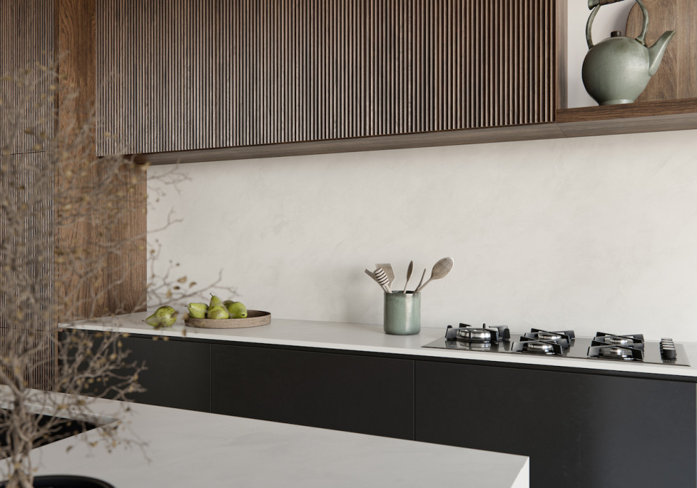
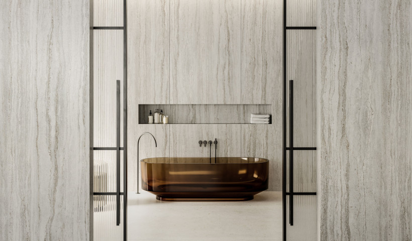
Dekton by Cosentino is an incredibly hard-wearing surface that is perfect for indoor-to-outdoor applications. Use it on benchtops, floors or walls inside and out to create a truly seamless look. It comes in 40 on-trend colours, including soft neutrals and ones that mimic natural stone, and a range of appealing textures. Plus, it’s UV, stain, scratch and heat-resistant so it will look great and perform brilliantly for years.
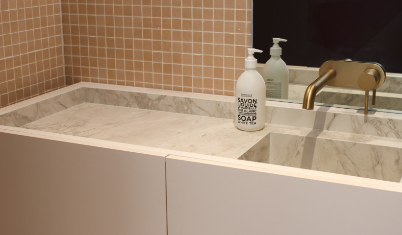
Another appealing option is Silestone by Cosentino, a high-performance surface that allows designers to create a luxe look with minimal maintenance in kitchen, bathroom and living spaces. It comes in 50 fashionable shades, including ones that give the luxurious look of marble and concrete. It’s scratch, stain and impact-resistant, and comes in super-size slabs for achieving expansive benchtops, sidings and floors without visible joints. Match Silestone indoors with an outdoor-friendly Dekton surface in alfresco areas. Or mix Silestone with other outdoor-friendly finishes, such as timber and stainless steel, for a warm, layered look inside and out.
2. Carry through the flooring
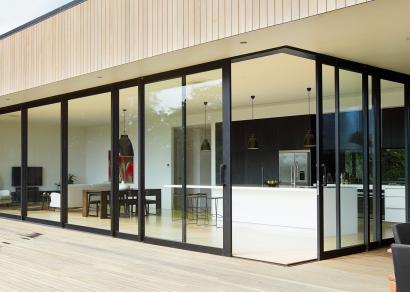
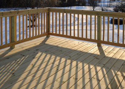
Enhance the indoor-outdoor connection further by specifying the same or similar flooring inside and out. It’s a particularly clever move if the kitchen is small as it’s hard for the eye to distinguish where the indoor space ends and the outdoor one begins, making the overall space appear bigger.
Tiles, timber and concrete all look fantastic indoors and they’re tough enough to cope with external conditions. When specifying tiles outdoors, make sure they are designed for exterior use and have extra slip resistance.
3. Keep it even
Thresholds — or lack of — are important when creating indoor-outdoor flow. Stepping up or down from the inside space to the outdoor one gives the immediate impression of moving from one distinct zone to another. To make the two areas feel connected, ensure the floor level is even inside and out, with no lumpy thresholds.
4. Go for wide openings
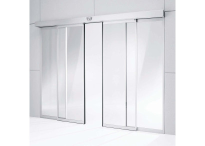
Emphasise indoor-outdoor flow by allowing the two spaces to open up completely with bi-fold, stacking or pocket-slider doors. This eliminates any physical barriers between the two areas and rewards the homeowner with unimpeded views.
Also consider adding a servery window. This makes it easy to pass food and drinks outside, while giving light and views a further boost. Add a shallow counter and some bar stools for a useful extra casual dining zone. Just make sure there's enough room; as a guide, there will need to be around 70-75cm counter space for each person to sit comfortably and be able to get in and out of their seats.
5. Allow for clean sightlines
Keep sightlines clear by positioning furniture so it’s not obscuring exterior doors. This allows the eye to move from inside to out and makes the space appear as one interconnected area. It also makes it easier for guests to move comfortably through the space and encourages them to gravitate outdoors rather than blocking up the kitchen.
Explore the full range of Dekton and Silestone at cosentino.com



 New Products





 Popular Products from Cosentino NZ


 Most Popular


 Popular Blog Posts
