 NEW
NEW
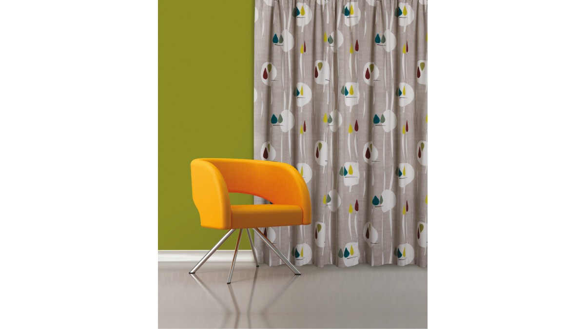
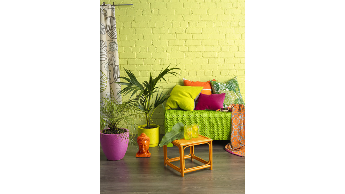
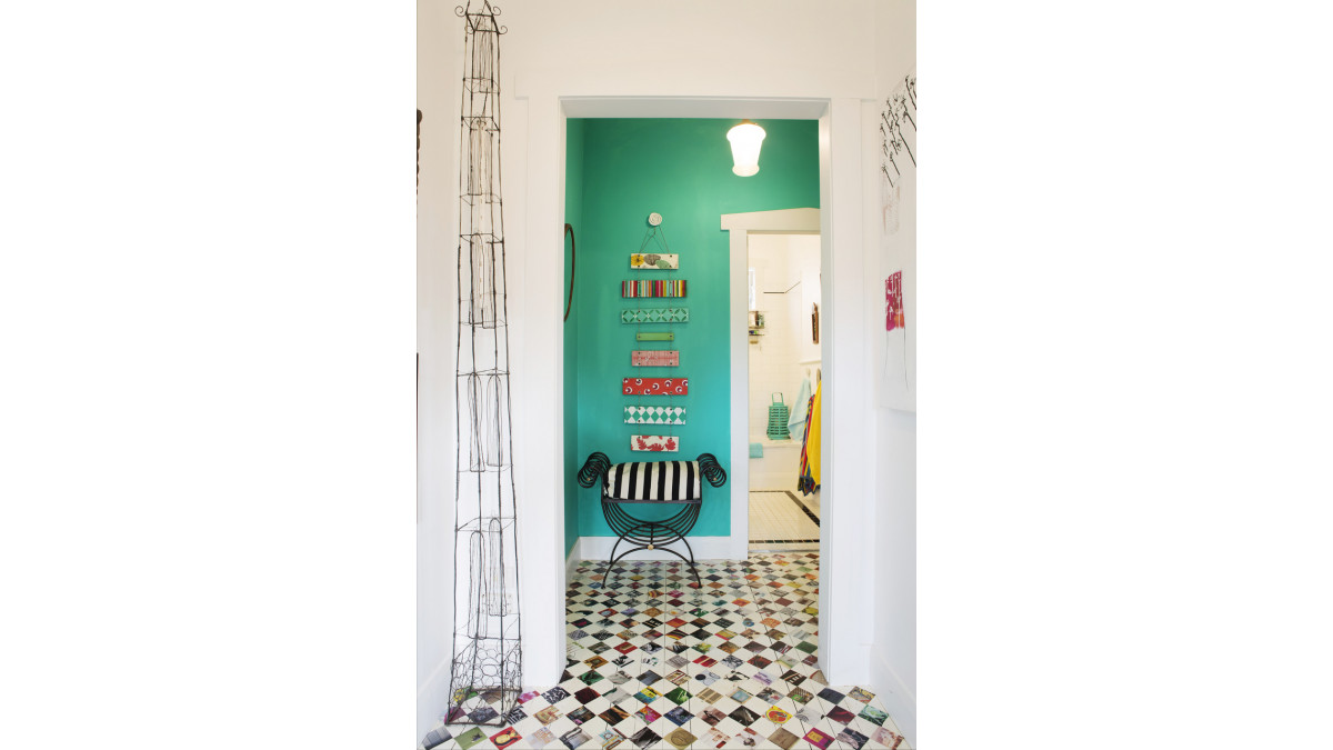
Think bold, luminous colours from your childhood paintbox and you’ve got the idea. Vibrant, optimistic hues like Resene Daredevil, a fluoro orange, Resene Spotlight, an egg yolk yellow, and Resene Windfall, a bright emerald and shamrock green. Or think Resene Elvis, a Memphis mid — almost electric blue, bold, brash and full of action-packed energy. Whether it’s touches of colour in accessories and furniture or feature walls, these colours provide excitement to neutral colour schemes.
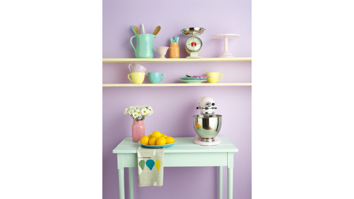
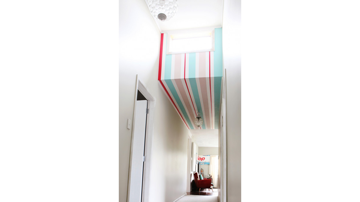
Scandinavian inspired colour schemes are also on the rise, with retro pastels being paired with bright red accessories. Pastel blues, greens, beiges, whites and off-whites, and natural light wood tones are typical Scandinavian colours, with an additional vibrant accent colour. The neutral white surfaces (floors, walls, ceilings or furniture) and bleached wood using Resene Colorwood Whitewash offset the colour flow from pastels to bright hues.
But we’re also seeing a change to the latest neutrals palette, with greys and whites merging subtly with yellows. Decorators still want a white scheme, but where they once used whites with a hint of grey (think Resene Black White) we’re moving more towards whites with a yellow undertone to warm things up. Whites such as Resene Orchid White, Resene Thorndon Cream and Resene Rice Cake are popular. Even classic Resene Pearl Lusta is coming back, but in lighter strengths, such as Resene Eighth Pearl Lusta.
Beiges are also warming up, mixing with rich creams, honeys and soft yellows. Think Resene Sandbar, a summer-inspired ochre yellow, and Resene Bittersweet, a tasty mustard beige that mixes retro hues with modern ones.
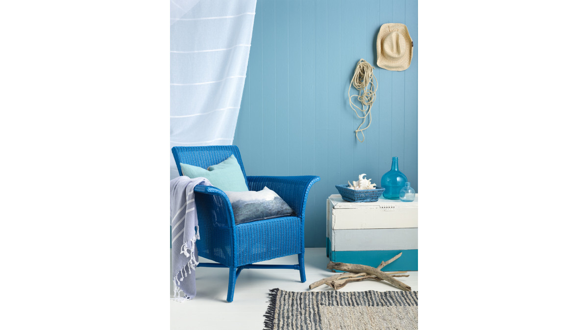
While yellow is one of the trending leaders of 2014, blue, the colour of clear open skies and calm seas, is undeniably au courant. While this is an international trend, it is strongly influenced by our local environment as New Zealand’s comes into its own. These blues and greens are the colours that work with our light and our landscape; they reflect our sea views or the beaches, rivers and lakes we drive past. The greens bring native bush home.
Soft blues that hint on the green side to mimic our seas include Resene Carefree, an opalescent tint of watery green, and Resene Reservoir, a pastel aqua green. Bluer blues on the pastel front include Resene Half Escape, a break-of-day tint of sky blue, and Resene Onahau, a gusty breeze of pastel blue.
Mid-tone blues have not been left out, with Resene Waterfront and Resene Hemisphere, both colours of great purity, and redolent of summer days.
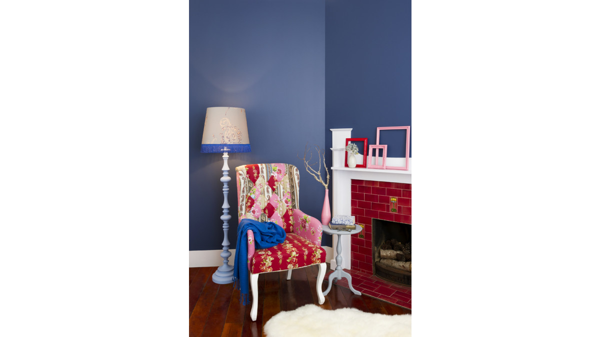
Deep rich blues such as Resene Whale Tail and Resene Submerge are sharp foils to other bold colours, like cherry pink Resene Knock Out and fluoro orange Resene Big Bang. For a lush navy, try Resene True Blue, the colour of deep oceans with a hint of violet. A primary dark colour of the season, it pairs well with most of the fun bright shades coming through.
Greens from the new palette are different from the greens of recent seasons; they are becoming more natural. The current season’s greens have either muddy undertones or clear minty ones, both inspired by nature.
For muddy undertones, look to Resene Kombi, a bright green with hints of spicy gold, or Resene Nirvana, a salty yellow green. There’s also Resene Miso, a soya bean-influenced yellowed neutral.
For a fresh, summery colour, try an apple mint green like Resene Kandinsky, or the retro-inspired Resene Mint Tulip, a pastel ice blue green that’s dewy and delicate.
Pinks are no longer the domain of the very young — they’re feminine, retro and very modern. Pair pink with modern-day orange like Resene Sentimental, a baby pink orange with pale tints of dreamy sunset warming it. Resene Sauvignon is a great tipple of pale pink that complements other soft hues such as Resene Tutu, another pale pink, Resene Bubbles, a simple tint of blue, and Resene Solitude, an introverted tint of blue, cool and dreamy, for a nostalgic colour scheme you might remember from childhood visits to nana’s house.
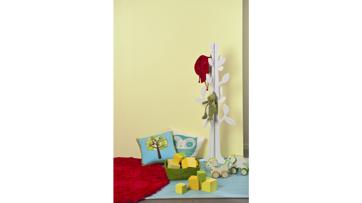
Yellow may be bold this season but it comes in toned down colours as well. Team the brighter colours with knocked back versions, such as Resene Melting Moment and Resene Bianca. For a pared back, softer orange, try Resene Guggenheim, or lighter yet, Resene Sandy Beach, which is midway between honey gold and pink.
The new palette sees a few vintage purples coming through, romantic colours that evoke wistful nostalgia. Soft blue lavenders such as Resene Birdcage, Resene Morepork and Resene Siesta are calming and elegant, while pink-based purples such as Resene Butterfly and Resene Centre Stage are scintillating and alluring.
The red palette continues to be a playful one, with shades of tomato, pohutukawa and crimson as bold as ever. They are unapologetically strong tones, and when paired with other retro colours, make for a bold, carefree statement, a direct link to our newly acquired sense of adventure.
Decorators are becoming more experimental with colour. Which is a good thing, because brights are here to stay. If you’re crazy about colour, 2014 is the year for you.
View these Resene colours in the Resene The Range fashion colours and the Resene Multifinish collection, available for viewing online at www.resene.co.nz/colour


 New Products







 Popular Products from Resene


 Posts by Resene Technical
 Most Popular


