 NEW
NEW
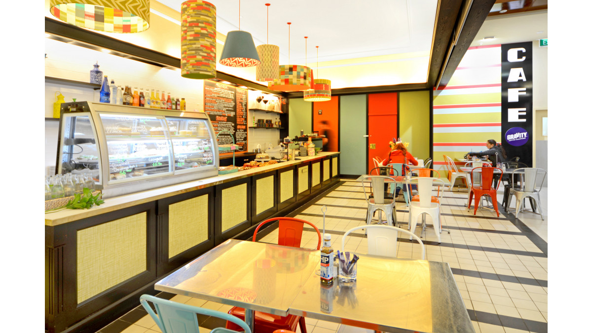
The mall management also wanted to attract a more youthful clientele. So the starting point for Amanda Neill of Designworx was the graffiti element in the existing Vauxhall Café in Devonport. This led to a more fully developed concept of a new brand image for the cafe, so that any expansion in future could be developed further within the same theme. The existing graffiti in the Devonport Café linked back to the retro past, so this was played upon and connected with a feel that would enhance an eclectic retro energy.
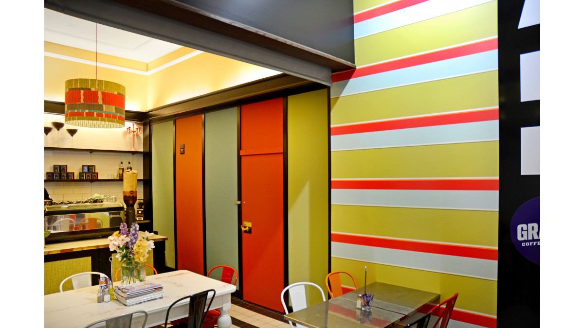
A panelled wall was painted in a colleciton of strong bold colours, to attract the eye and to be used as a backdrop for chalkboard comments to be written by customers. Resene SpaceCote Flat waterborne enamel was used, tinted to Resene Avocado, Resene Well Read, Resene Undercover, Resene Hawaiian Tan and Resene Bluegrass. The menu board is Resene Black with a striking Resene Hawaiian Tan border.
The mural incorporated the name "Vauxhall" in retro graffiti style imagery and pulled together all the paint colours that were used on the panelled wall, on a neutral background of Resene SpaceCote Low Sheen tinted to Resene Alabaster.
Three large wooden tables harking back to previous era, were painted in a selection of the colours, then over-painted in Resene White and rubbed back to allow a distressed chipped look of colour to emerge through. They were then over-coated in Resene Multishield clear to protect the look.
Bench seats were also painted in Resene SpaceCote Low Sheen tinted to Resene Avocado and Resene Bluegrass to fit and a selection of brightly coloured metal chairs were added to complete the theme. Décor items were strategically placed to carry it through.
All the colours were chosen for their strength and were intense enough to make a statement. They also needed to be bold enough in their chroma to be seen from a distance to attract attention. The colour palette references the retro past as colours like the Resene Hawaiian Tan and Resene Avocado were often seen in this era.
Lastly, colours were chosen for their influence on our physical response to them. Orange stimulates the mind and aids conversation, it also aids digestion and red stimulates the appetite. So given that a café is a place of socialisation and enjoyment of food, Resene Hawaiian Tan and Resene Well Read were important colours to include in the palette. The inclusion of blues and greens, from the cooler side of the colour wheel still contain enough warmth to convey a welcoming feeling.
The result is a kaleidoscope of colour, pattern and energy that attracts the eye and makes a strong bold statement.
Resene has worked with hundreds of retail owners and managers to achieve and maintain their retail images. Whether you're creating a nationwide retail image or a local store, Resene has an extensive range of quality paints, stains and specialist effects finishes, colours and professional advice to ensure you get a superb finish.
From striking metallics and textured finishes to mysterious hues, restful neutrals and an extensive range of wallpapers and exclusive fabrics, Resene will help you discover your retail uniqueness.




 Product News







 Popular Products from Resene


 Posts by Resene Technical
 Most Popular


