 NEW
NEW
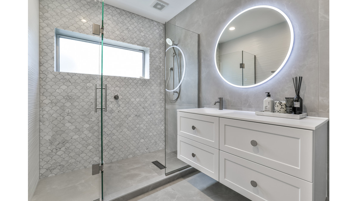
Without moving any walls to adjust the physical size of the room, this 20-year-old guest bathroom has been transformed into a spacious, light and contemporary space.
The original room had an unusual layout which didn’t maximise the space available and was adorned with darker, small format tiles that only went partially up the walls. A corner acrylic shower was situated just inside the doorway which although wasn’t very large, jutted into the interior of the space. It also created a real pinch point for bathroom users to get to the toilet at the rear of the room, having to squeeze between the shower and a small floor mounted vanity.
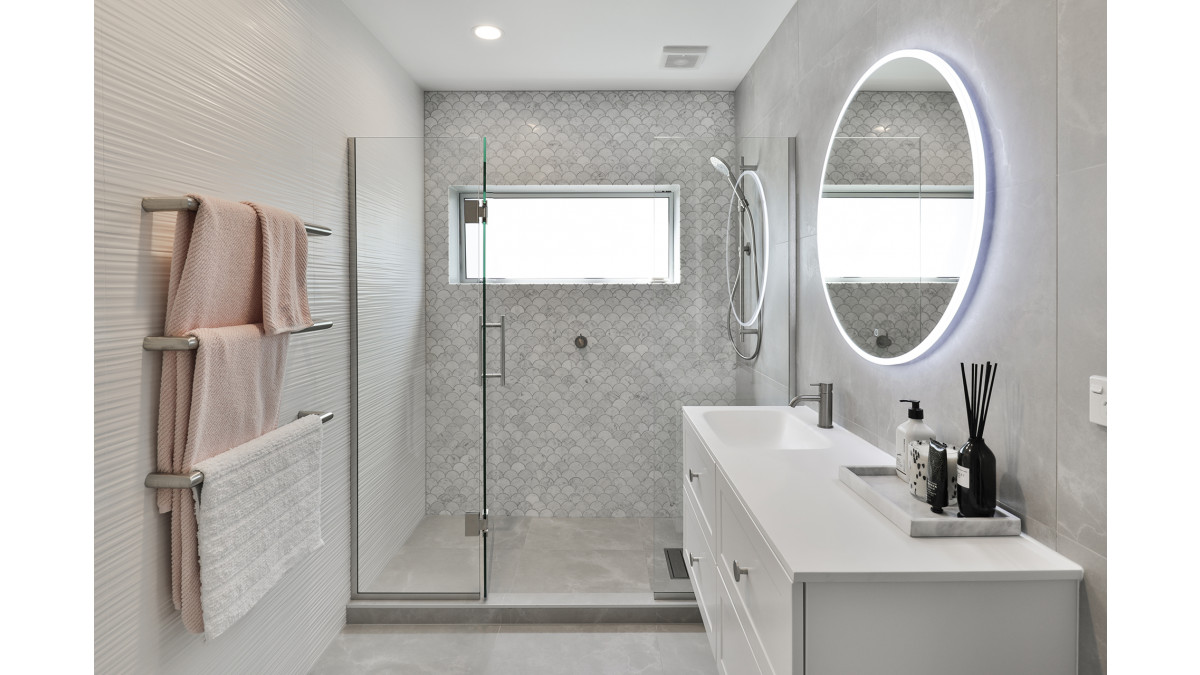
By completely gutting the bathroom and reconfiguring the layout, the room was immediately opened up and flow considerably improved. The position of the toilet and shower were swapped which enabled a large, tiled shower to run the full breadth of the room. A much larger vanity could now also be accommodated, which was wall mounted to further enhance the sense of space.
Despite the room's small size, three different tiles from The Tile Depot have been used. A large format 600 x 600mm porcelain tile, Stardust Moon, flows across the floor and into the shower, and up to the ceiling on two walls. Two different feature tiles adorn the two remaining walls; Fish Scale Carrara mosaic that creates a real feature in the shower on the wall facing the room entrance, and a white textured wall tile called 4D linear white, that flows continuously along the wall and into the shower. By laying this tile with its raised linear texture horizontally, the texture further added to visually lengthen the room.
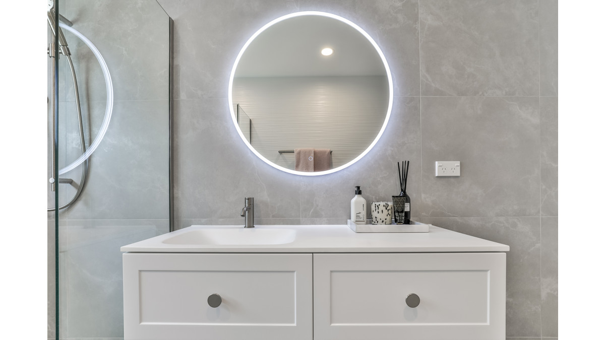
Floor to ceiling tiling that extends into the shower, expands the visual sense of depth and height in the room. Three different tile selections do not overwhelm the space and instead work together to create texture and interest, reflect light, and give the room its contemporary character. Improved ceiling lights and a Broadway LED bathroom mirror considerably improved the light levels in the room without the need to install a larger window.
Through simple layout changes, great tile selections and considered installation, this bathroom was taken from drab and disjointed, to fabulous and flowing. Despite no adjustments to the physical footprint of the room, the addition of a larger shower, larger vanity and three different tile choices, this guest bathroom feels considerably bigger than its previous arrangement and is a great demonstration why sometimes space can be created when there may appear to be none available.



 New Products






 Popular Products from The Tile Depot


 Most Popular


 Popular Blog Posts
