 NEW
NEW
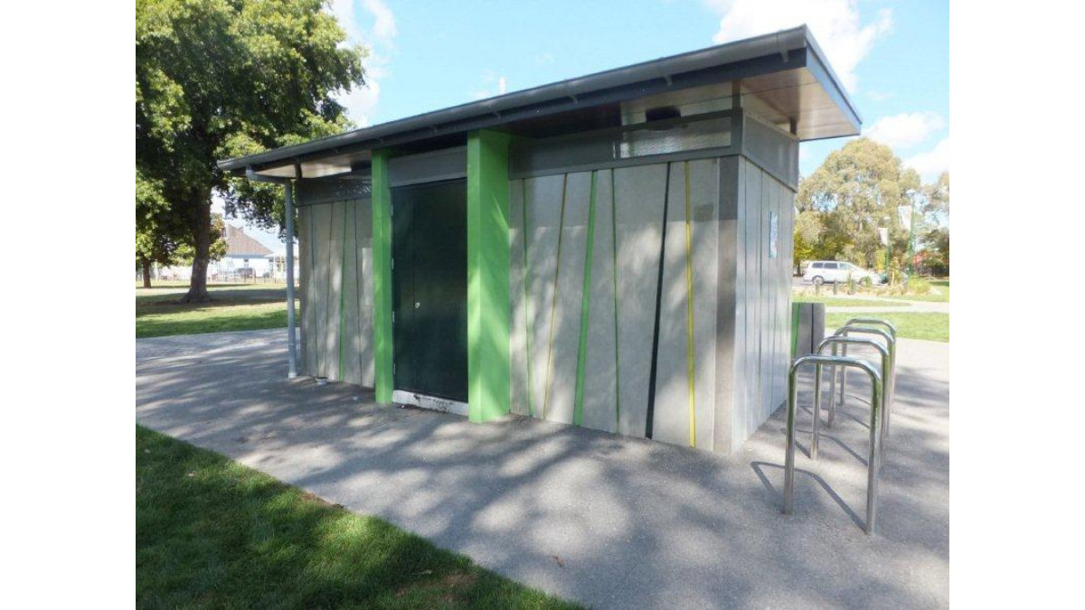
 Commercial Exterior Maestro
Project: Flaxmere Public Toilets
Practice: Citrus Studio Architecture
The fresh hues against the stark concrete has a lovely freshness about it. The colour palette is made subtle with the backdrop of the trees. It has a cleverness about it. Normally this would be narrative but it is surprisingly abstract. The cute architecture is highlighted with lively hues that play delightfully together. They have done enough and restrained themselves from overdoing it. Just perfect.
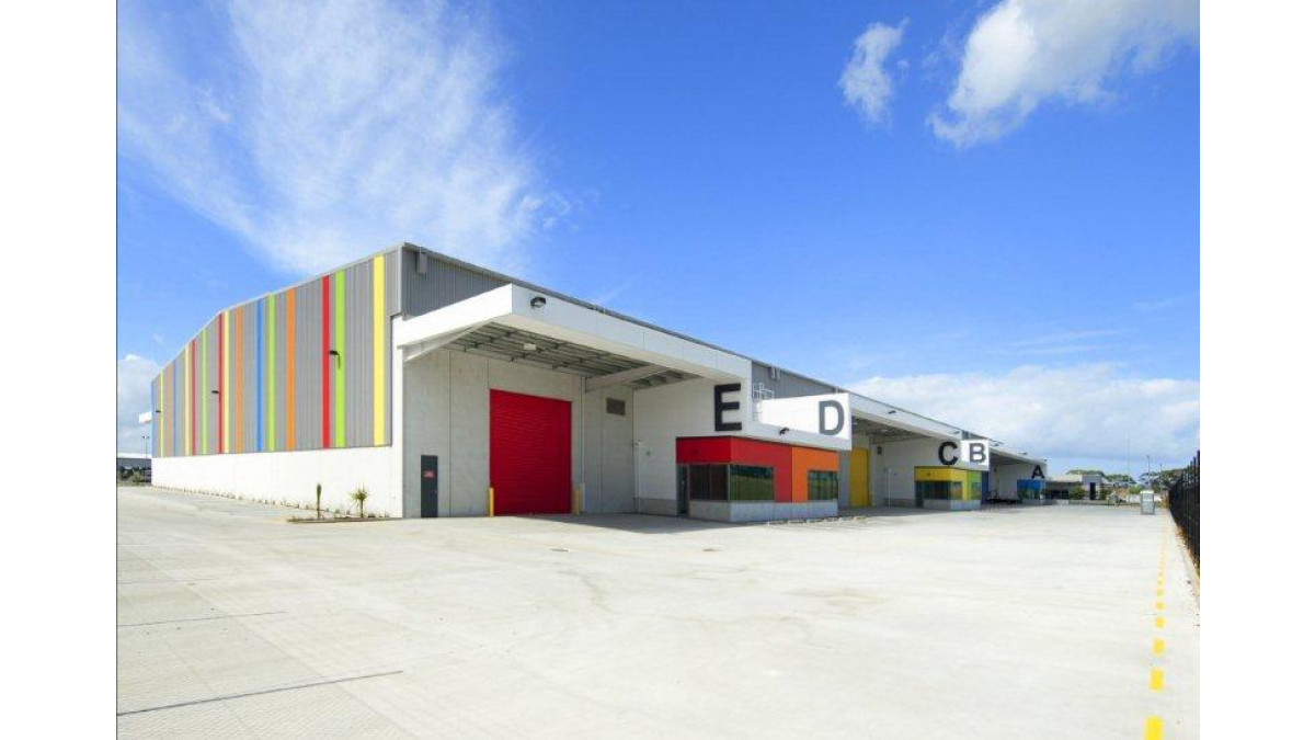
Commercial Exterior Winner
Project: Site 7 Auckland Airport
Name: Maurice Langdon
Practice: Eclipse Architecture
Magical impact as we see colour being used as a language, not just a token way-finding. It is nice to see that the colour use isn’t based on a corporate identity, but is focused on clear topography. It is just right. It’s a simple yet very effective way of making a utilitarian building completely interesting through the use of block colour and creative colour stripes.
For more excellent use in colour, view all Resene Total Colour Awards 2013 winners.




 Product News







 Popular Products from Resene


 Posts by Resene Technical
 Most Popular


