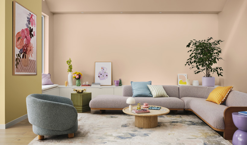
Colour selections are always influenced by the mood of the world, and the Dulux Colour Forecast 2013 - Colour Movement explores how colour is moving around us, shifting and changing in rhythm with social movements, nostalgic longings, and digital influences.
Designed to energise, the Blur palette daringly combines unexpected and often clashing colours, in a whirl of reds, pinks, purples and oranges.
Blur is daring and bold. The hues are vibrant, creating excitement as they’re used together, with pinks, fuchsias and purples contrasting and clashing with oranges and almost-reds.
The vibrant purple of Dulux Akitio jostles for the spotlight in this bright palette. Along with the rich red of Dulux Oxford Terrace, the candy pink of Dulux Vivian Street and the vivid orange of Dulux Mangatainoka, the layers of this range can create a hyper-real space, a bubble of intense brightness.
The Blur palette was designed by Dulux in collaboration with Ella Leoncio, a Melbourne architect who specialises in residential design and who also authors the blog pages from my moleskine and is a regular contributor at yellowtrace.
Says Leoncio: “Blur is a very daring and bold palette. I like the way the colours read together as a set. The purple and the orange in particular look really striking together.
“It’s about layering pattern and colour to create a space that is vibrant, bold and attention grabbing, to the point of being otherworldly.”



 New Products





 Popular Products from Dulux



 Posts by Dulux NZ Technical

 Most Popular


