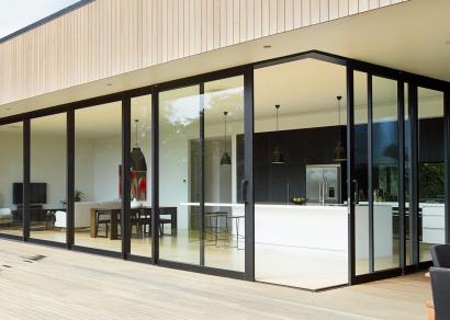
 VANTAGE Windows & Doors
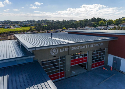
 Roofing Industries
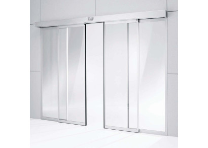
 dormakaba
 Resene
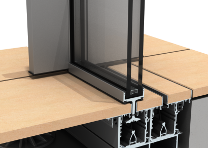


 Vulcan Building Systems
 Product News
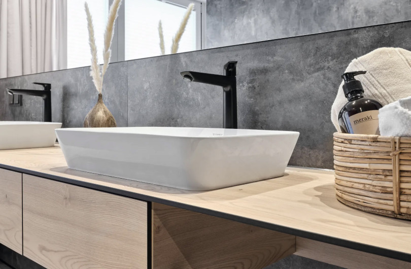


 Dulux
Dulux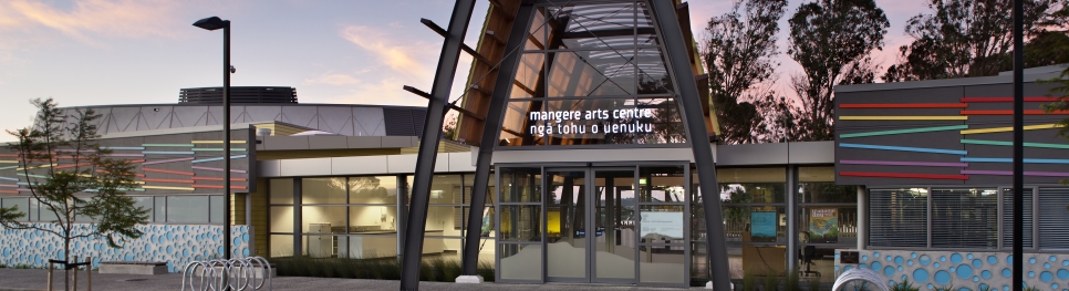


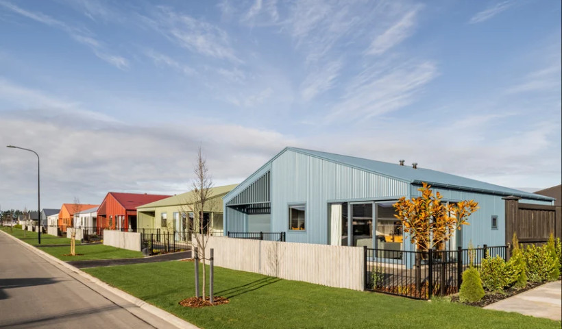
When it came selecting the colour scheme for the exterior of the Arts Centre, Creative Spaces looked to local Maori and Pacific Island mythology, legends and beliefs to inform their colour choices. Uenuku is known to the local Maori as the God of creativity, and his physical manifestation is the Rainbow.
From this stemmed the colour palette for the exterior of the Arts Centre, which is expressed in the batons on the exterior entry façade. Te Puna is a traditional Maori and Pacific term that applies to a puna wai or a spring of naturally flowing water from the depths of papatuanuku - mother earth. Te Puna can also be applied to a source from which artistic skills and all things scholarly flow. This was expressed in a series of precast concrete panels with bubbles, which represents the water rising from the spring, and accented in two subtle shades of blue, which provide depth.
Colours Used:
- Dulux Red Terra
- Dulux Play School
- Dulux Limone
- Dulux O'Grady Green
- Dulux Brig
- Dulux Dismbark
- Dulux Pink Jazz
Dulux Product:
-
Dulux Aquanamel Semi Gloss
Commercial Interior Project Description:
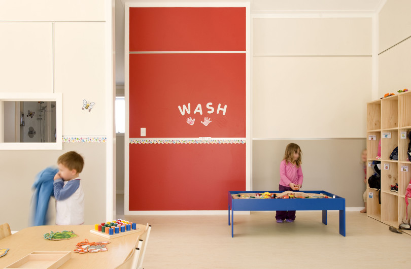
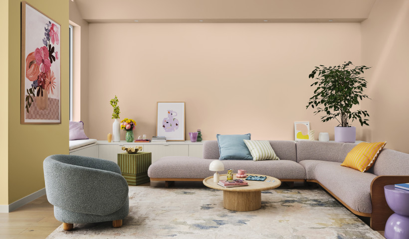
The interior spaces of Mangere Arts Centre are formed together with the architecture of the exterior. The steel structure, honed concrete, ply walls, soffits and plasterboard were best expressed in a fresh white, with warm neutral tones used for service areas; a deep moody grey used for areas within the performance space and accents of colour used for way finding. It was vital that large areas of wall were available as blank canvases for future artworks created for or at the centre, with the neutral scheme allowing for this.
Colours Used:
-
Dulux Mt Aspiring Half
-
Dulux Dawson Falls Quarter
-
Dulux Mt Eden
-
Dulux Red Terra
Dulux Product:
-
Dulux Wash & Wear 101 Advanced

 Popular Products from Dulux


 Posts by Dulux NZ Technical
 Most Popular