No matter how well your medium density design may be planned out, all most people are going to see is the front of the building — and the finished appearance is what your project is going to be judged on. We all know that is so unfair, for despite the hours of design work to ensure you have great indoor spaces, clever internal circulation, quality materials for inter-tenancy walls and floors, excellent layering of the external facade wall underlays and outstanding insulation, if your medium density building doesn’t look great, it will get dismissed as “meh” or even worse, “a bit rubbish”. Humans are largely visual creatures and what we see with our eyes we tend to judge with our minds. So, yes, your building needs to succeed from the outside.
The internal view is even more important for the inhabitants though. So few designers of MDH actually live in a medium density development, and even less of them in a MDH building that they have designed themselves. There’s a maxim that I have in all my designs — don’t design anything that you wouldn’t be prepared to live in yourself. Not just stay overnight in, but actually live there for a year, or a number of years. It's only that way that you can truly live with the consequences of your own design. Being on the inside and looking out is a fundamentally different view of a building than what an awards jury might see, looking at the building from the streets outside, or that the public might see as they casually walk past.
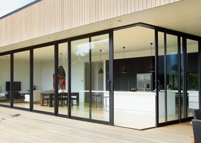
One of the classic mistakes that some designers make is to have too many openings on the external facade. Big wide glass sliding doors opening up onto a narrow deck, or worse, constrained behind a glass waist-high balustrade. There are some well-known examples of over-glazing, including some prominent NZIA Award-winning examples, covered in glass, as transparent as a jellyfish shimmering in the ocean in all the glossy photo sets from the opening weekend. And yet if you go to visit them now, you’ll find the glazing shrouded behind layers of curtains like a bad hotel suite, layer upon layer, to valiantly try to keep out the excessive sunshine and the prying eyes of the neighbours. Well-considered glazing is good, poorly-placed and badly-proportioned glazing is somewhat of a curse. You will want to get to know your neighbours across the street, but you do not want to get to know them too well.
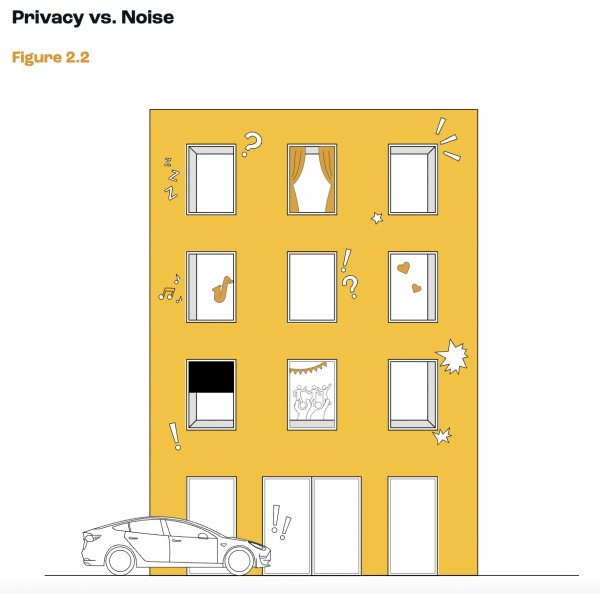
Consider the facade therefore as an exercise in carefully proportioned rules. Consider where the furniture would be placed inside at the same time as designing the outside. Do floor to ceiling glass panels make sense or would it be better to have a desk against that wall, or a chest of drawers? Is there a place to put a painting that is not in full sunlight? If you were getting undressed in the bedroom, would you need to draw the curtains every time you removed some clothing, or is there a solid return wall that you could easily move behind for privacy?
Go for a walk around your neighbourhood and have a look at some of the badly designed MDH that you will (sadly) undoubtedly encounter. In every glass-paned facade that goes down to the floor, there will be piles of boxes stacked against at least one of the windows, containing items that deserved a storage cupboard more than a window. There is a prominent example near the School of Architecture in Wellington, where we can look into the lives of the poor souls who live in this disastrous MDH example. Balconies facing south, overlooking a busy road, mean that they are never occupied, except as storage for broken furniture. Full height glazing in every room features a display of the detritus of daily living, as we follow the inhabitants' every move and relationship breakup, with beds pushed up against the glazing. Better design would have given them more space, less waste, and more privacy, as well as a better looking building.
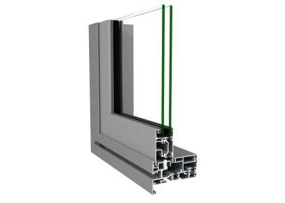
It’s during this design phase that the pragmatic aspects of design must be considered too, with decisions about the physical build-up of the external facade. Select the best facade system that your project can afford and detail it carefully, with the knowledge that in tall buildings water can get driven upwards just as much as it can dribble downwards. Maximise the insulation, on the external face if you can, and ensure that the drainage cavity can always be ventilated to the outside air. Incorporate the best thermally broken windows that you can specify and design them so that they maximise the glazing between 1000 and 2400 to allow freedom of layout internally. Then, purchase one of the units yourself and live there for a year at least, so you can apply what you have learned to the next project that you design. And finally, remember these words: Medium IS the message.











 Most Popular
 Popular Products


