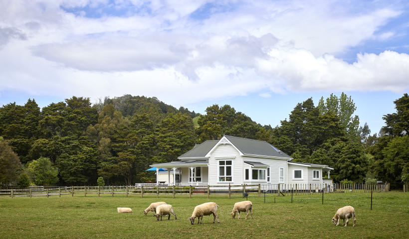
“Our clients actually lived here in an ex-state house prior to the build,” says project architect Michael Dalton. “It sat in the middle of the large section, and they were very short on space, so they were enthusiastic about the opportunity to utilise the land to its full potential.”
Taking their aesthetic cues from the street, the RTA team was inspired by the simplicity of the surrounding single-storey dwellings. Following suit, once the gabled forms and pushed, pulled, and repeated them to create a five-bedroom dwelling that stretches from the front to the back of the property.
“Being in an urban environment, planning rules and height in relation to boundary are always a consideration, and this naturally puts emphasis on building in the middle of the site,” says Michael. “We created a single-level building to maximise the available space, and what really interested us was dealing with the scale of the building by splitting the gable to utilise the inside-outside connection and create a series of different volumes.”
Opting for several interconnected pavilions rather than a single voluminous form gave RTA the opportunity to explore courtyards as a hero feature of their design built by Ninety45, with the pavilions arranged around them for shelter and to allow sunlight into all parts of the house. The front door is located between two of the peaked structures and ushers you into a wide corridor below a flat, slatted-cedar ceiling. “This is the spine of the house,” says Michael. “Its generous size makes it a gallery-like space you can circulate through and filter off into different areas from.”
The section is longer than you can appreciate from the road and slopes steeply as it rises to the rear boundary. The split-level plan accommodates this incline, with the front of the home dedicated to public zones, the journey up the stairs to the bedrooms enhancing the sense of retreat.
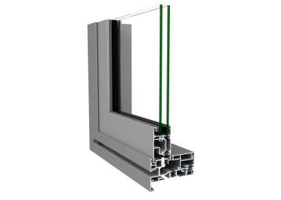
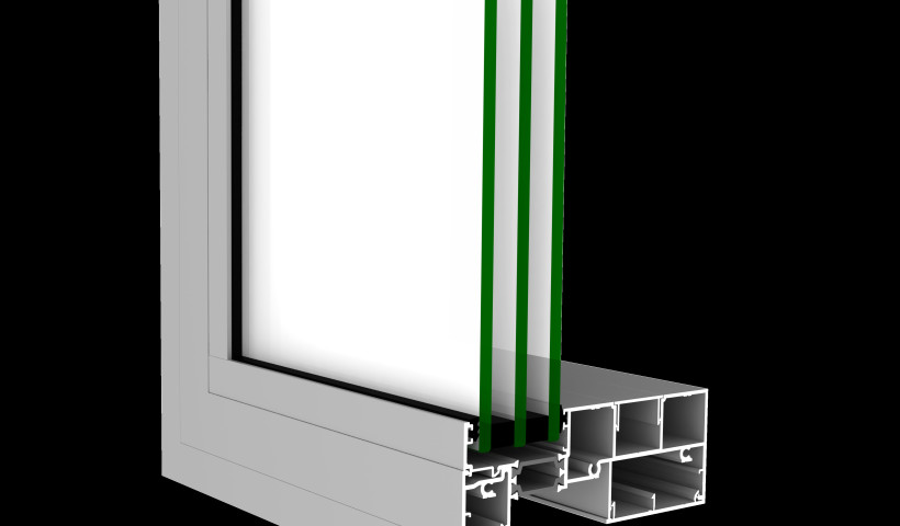
To boost the west-facing home’s energy-efficiency, RTA arranged multiple windows on the northern side to achieve solar gain. High-performance ThermalHEART joinery was selected to regulate this gain as well as heat loss for increased comfort year-round. “Designing all the gabled forms with large openings from First Windows & Doors really maximises the light while allowing for a breeze through the house as well,” says Michael.
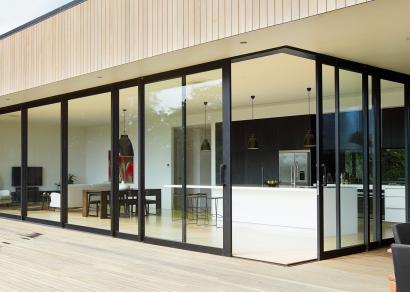
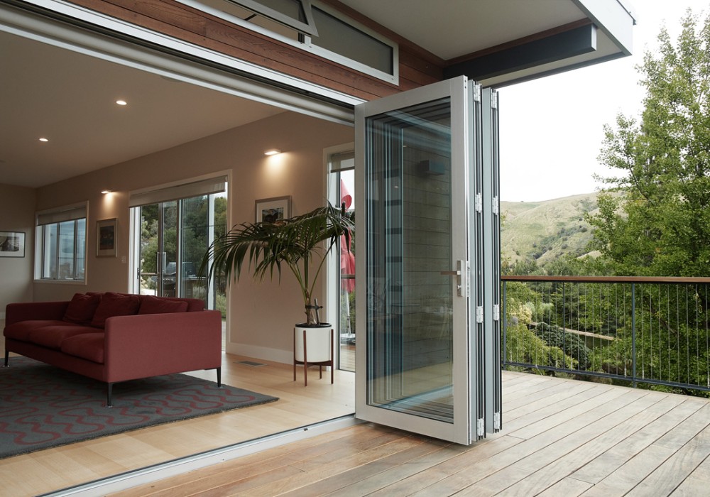
Stacker sliding doors bookend the living room, creating a wonderful sight line that extends from the leafy front courtyard to an internal courtyard that accommodates outdoor dining and an elevated pool, and leads towards the main bedroom further up the hill. “The house utilises cross-ventilation, but there are also some good active systems in here, so when you’re not able to use the passive ones, you’ve also got good insulation and underfloor heating,” says Michael.
Another big focus for the team was designing a low-maintenance home in which all the materials are robust and long-lasting. To this end, they chose to clad the pavilions with bagged, plastered bricks juxtaposed with board-and-batten timber in contrasting black and white on either side of the home’s spine. The bricks travel from the outside in, wrapping themselves around the fireplace in the living area.
“With open-plan, you can lose the comfort and intimacy achieved with a separate living space,” says Michael. “Here, you get a feeling of openness, as the lounge has a relationship with the dining and kitchen area through a large internal opening, but it also has the ability to be completely closed off with hidden sliding doors.”
Indoor-outdoor flow is more than just a concept here; living takes place within, across and around the interconnecting spaces, allowing the family to use all areas of this home on any given day, in any given season. Linked to each other and the outside world, the pavilions are proving to be a beautiful backdrop to a new-and-improved life as they know it.
Originally featured in homestyle magazine. Words by Alice Lines



 New Products





 Popular Products from FIRST Windows & Doors


 Most Popular


 Popular Blog Posts