Richard Furze grew up in a well-known Taranaki building family, which may explain his fascination with renovations. When you know the hard work that goes into putting up an original building, you think hard about the best way to preserve its outstanding features while sensitively updating anything that could do with an upgrade.
This project, which involved a comprehensive reinterpretation of a quintessential 1970s family home, called for a thorough rethinking of interior functionality. As in many modern homes, a renewed focus on the kitchen drove innovation in the layout.
What were the challenges in this project that inspired the solution?
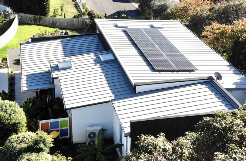
"We wanted to preserve the feel of this semi-iconic 1970s home, and to bring it into the current era with modern building methods, materials and other design features that help make the house very livable during all seasons.
The main view out to sea is in the northwest, while the best outdoor space was in the east. A not-so-attractive neighbouring house stood in the way of one of the main northern views, so we had to carefully place windows and the kitchen. We also wanted to make the most of the sun and the connection to the deck that overlooks the pool, while creating an open-plan space for dining and a family area that works with the pool, views and sun."
Do you have a distinctive vision for cabinetry, and storage in general, in residential design?
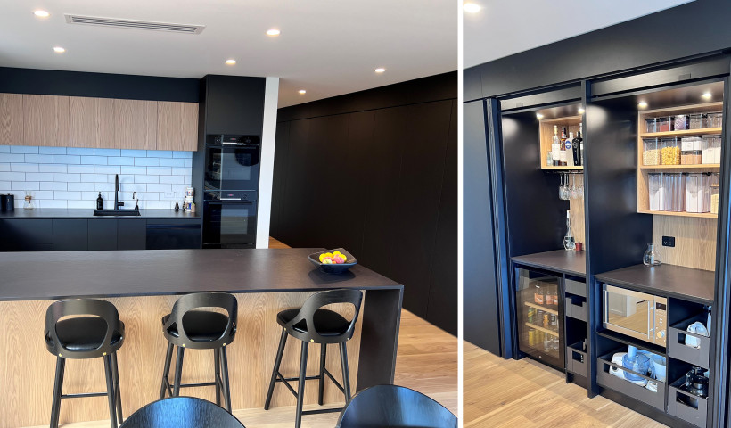
“I like the kitchen and other associated joinery to have more of a furniture feel, and to seamlessly flow between the working, cooking and small office spaces that often are incorporated near the kitchen. Sculleries are common, but I like to create the ability to hide these from the main area. This promotes the feeling of exploration and surprise while still providing very usable and practical areas.
This house includes false paneling that also hides the master bedroom door and gives the impression of the main joinery running further than the main space. The materials are broken into different textures and colours to minimise the bulk of the cabinetry, and to further delineate the different zones that have been created within the joinery.”
In your opinion, what are the most interesting trends in kitchen design?
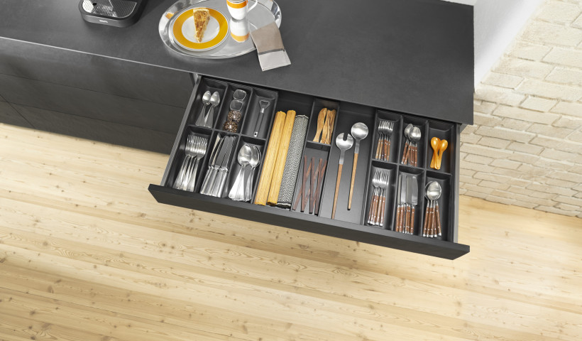
“The drive to give the kitchen more of a joinery feeling, and less basic kitchen. The standard layout myths are being challenged as the inclusion of better hardware allows a re-think on how a kitchen usually works. People are incorporating general household storage into less accessible areas of the kitchen, along with spaces for display and computer tablets. These areas should be seamlessly designed in from the start, to work in with the main joinery.”
Are clients requesting handle-less solutions when specifying kitchen storage?
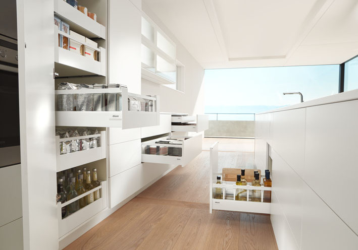
“I think people are becoming bored with the standard look of handles or the recessed handles that are commonly seen. New hardware allows better options to achieve pure handle-less which actually allows for more storage.”
What is your process for developing a kitchen design for a client?
“The first thing is to understand the client’s cooking techniques, abilities and how keen they are to spend time in the kitchen. From there you can look at the age of the family to help select materials best suited for them and the longevity of the house, to make it easy to maintain. The other important element is the flow of the kitchen to the outdoor areas, and how to create the best use of the space when you have many people around.
The remaining drawer and cupboard layout follows form, to create the look and feel that the overall project is trying to achieve.”
What are the hallmarks of excellent design in homes in 2018?
“Having spaces that challenge newcomers to the buildings, while maintaining a sense of peace and order.
This makes for rooms that can evolve with the client and families while still keeping a strong aesthetic design as the building ages. Clever use of materials and textures assists with this.”


 New Products





 Popular Products from Blum


 Most Popular


 Popular Blog Posts
