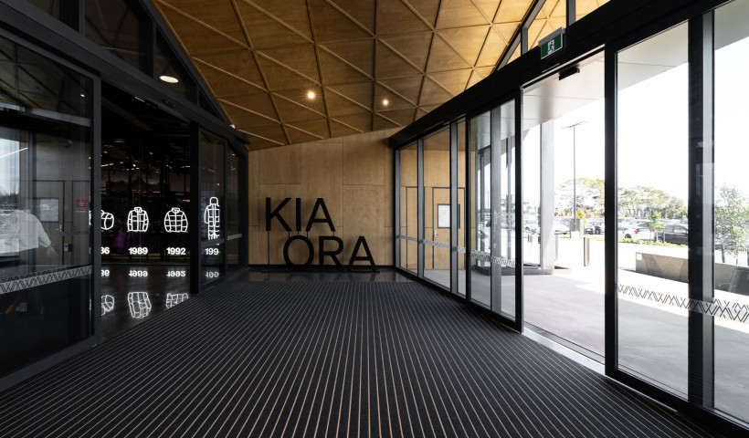
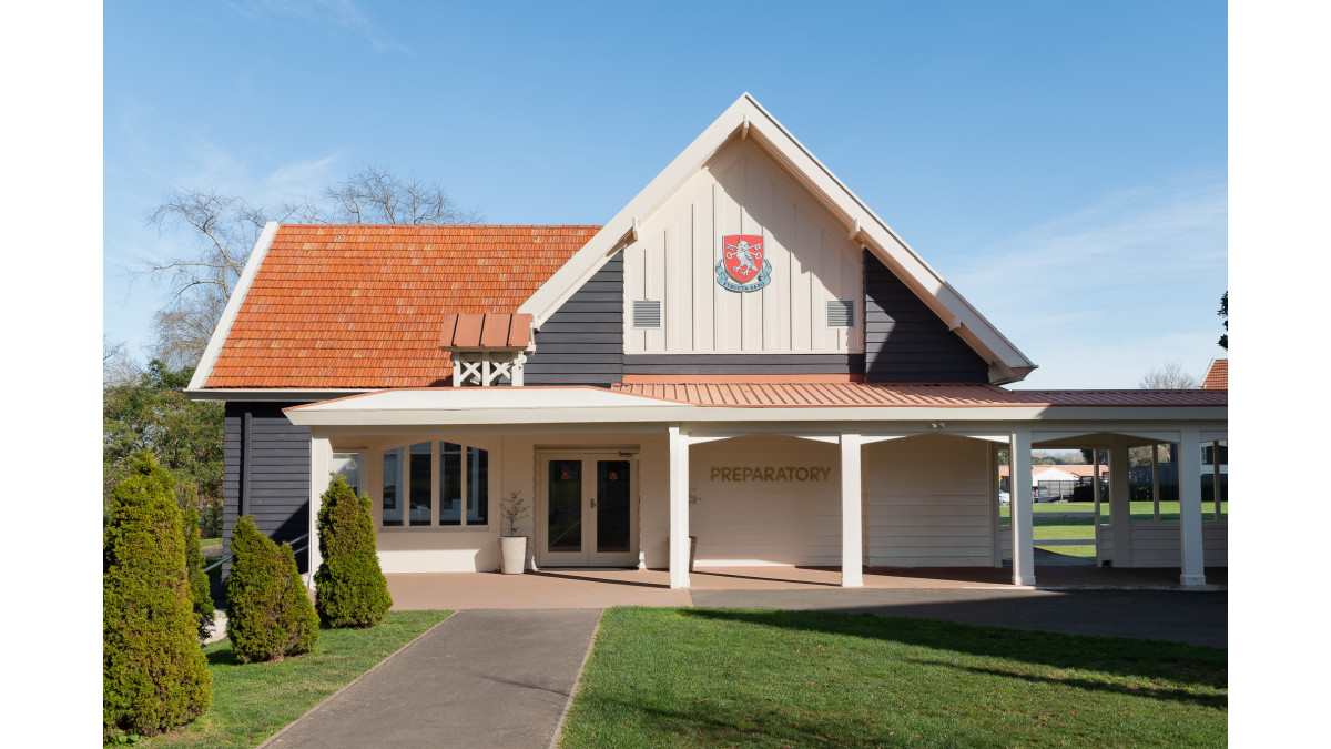
St Peter’s School in Cambridge, designed in 1936 by American architect Roy Alston Lippincott, is a site rich in history. For the refurbishment of its Preparatory and College buildings, interior design studio Designwell sought to preserve the school’s architectural integrity while enhancing it with modern functionality. A key element in achieving this balance was Advance’s Symphony2 Entrance Matting.
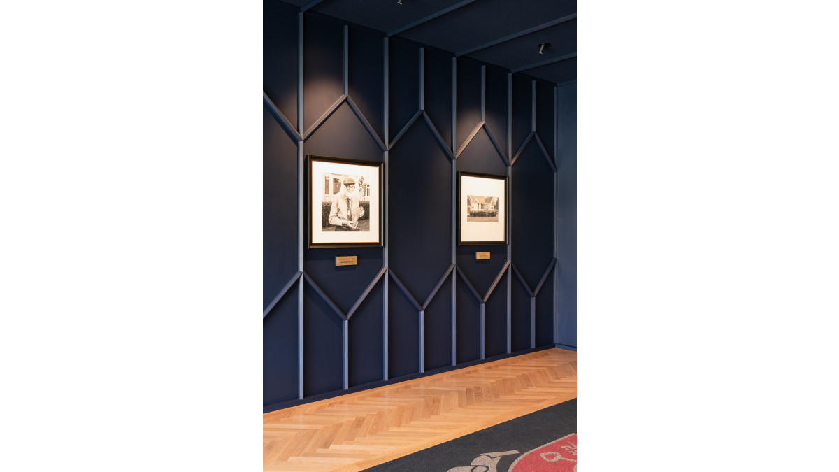
"The design of the school was inspired by the elegance of an English country estate," explains Jacki Welten, Senior Interior Designer at Designwell. "The project involved working with timber furnishings, intricate panel designs, and stained glass, all of which were part of the original character."
Designwell’s approach centred on respecting these historic design elements while making essential updates to meet the practical needs of a modern learning environment
Integrating the school’s identity into functional spaces
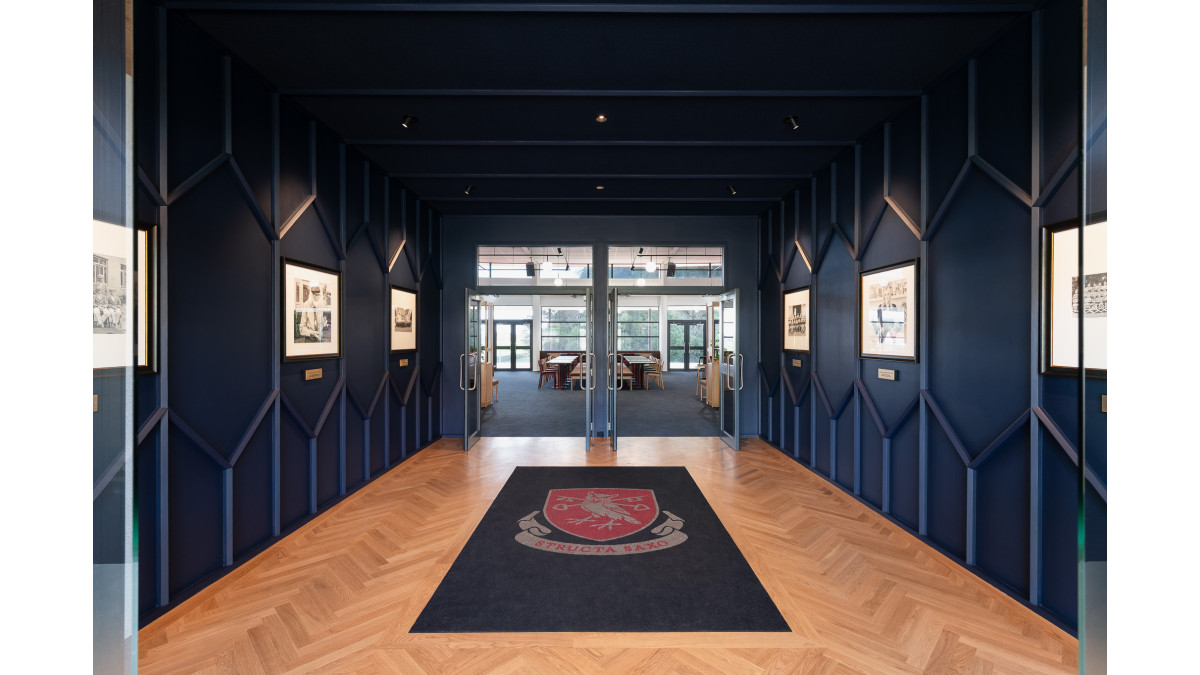
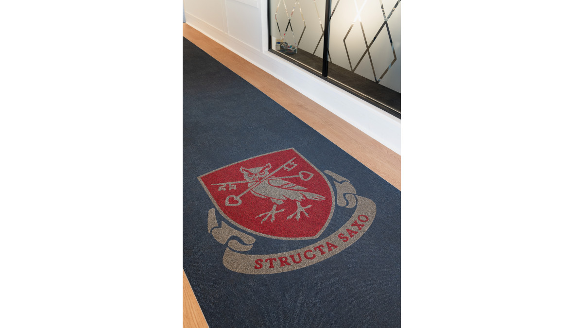
As part of a broader brand refresh led by their sister company, Daymark, Designwell incorporated the updated school crest into Symphony2 matting, installed in the entry halls of the two main buildings.
"Symphony2 was chosen for its durability in high-traffic areas and its ability to be customised for branding," says Jacki. "Incorporating the school’s crest into the entrance matting was a thoughtful way to connect the schools visual identity with its physical spaces."
This design not only reflects the school’s motto, Structa Saxo (‘built on a rock’), but also underscores the importance of creating durable, well-grounded spaces.
Durable design that lasts
Using precision water-jet technology, Advance crafted the school crest in red and grey Symphony2 matting. The final installation is built to withstand heavy foot traffic while retaining its aesthetic appeal for years to come.
"The custom-cut matting offers a long-lasting solution, providing both functionality and a visual nod to the school’s heritage," says Lincoln Macintyre, Product Manager at Advance. "Symphony2 is designed to endure high use, keeping the entryways clean and safe while complementing the overall design."
For Designwell, integrating branding into the flooring helped bring cohesion to the project. "It’s a practical solution that also enhances the interior design, bridging the gap between the school’s historical context and its updated visual identity," Jacki concludes.
Product: Symphony2 Entrance Matting
Designer: Designwell & Daymark
Photographer: Designwell
Writer: Folio





 New Products







 Popular Products from Advance


 Most Popular


 Popular Blog Posts
