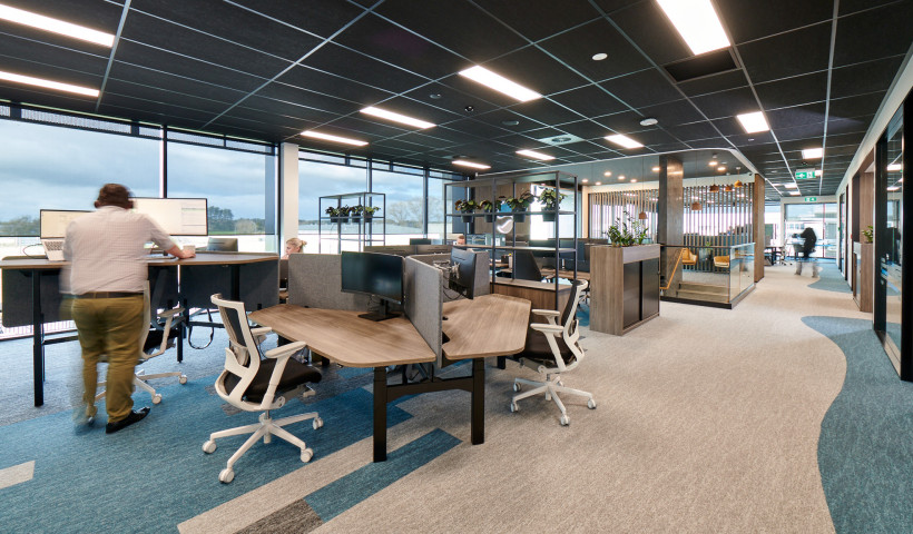
While Millennial Pink takes over clothing stores and the home décor market, commercial office interiors are using deeper, richer colours for longer life and stain resistance.
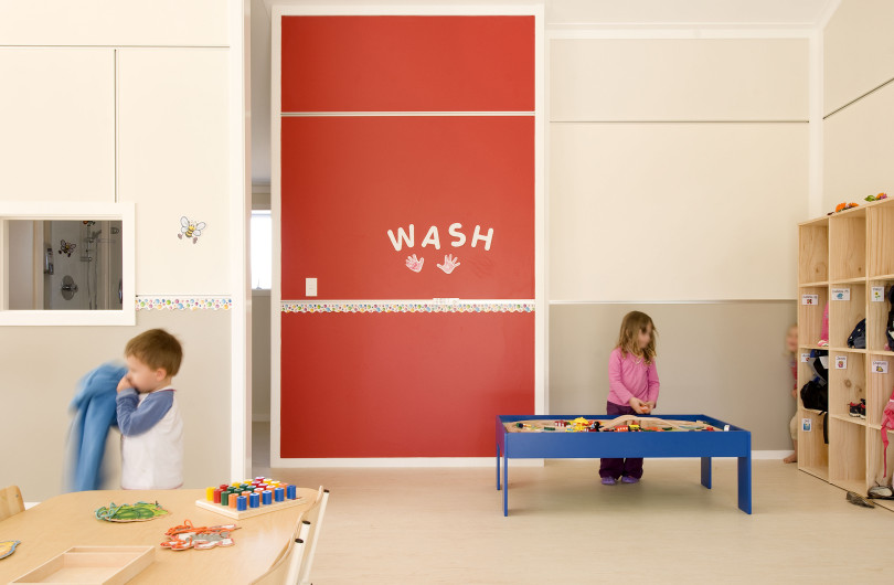
Colour has a strong tradition in commercial and education buildings. As places used intermittently — to visit, work, or study — colour serves to create vibrancy and a sense of fun. It creates memorable spaces. It affects moods. And it helps communicate identity and values. Colourful commercial interiors express innovation, and celebrate NZ's place in the South Pacific. Colour creates a point of difference.
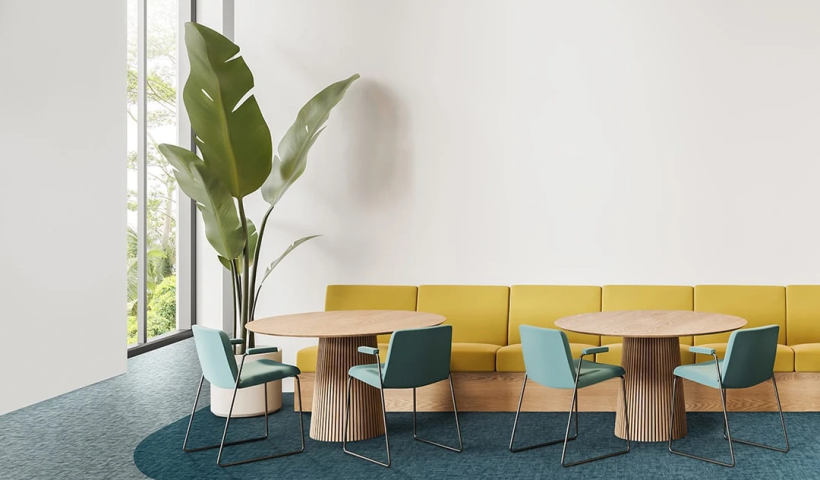
Advance Flooring now imports the beautifully coloured Prima and Galerie commercial carpet collections by French textile designer Tecsom. Their bold colour palettes offer huge variety to interior architects and designers. The removable loose-lay flooring tiles use 100% polyamide yarn and a stabilised PVC backing. Carpet tile joins have a seamless appearance, so that clients can have all the benefits of a carpet tile, but with the aesthetics of a broadloom finish.
These carpet collections have a wide range of neutrals to choose from. But to express a sense of place or a strong identity in a project, designers can select from a well-curated modern colour palette by one of France’s oldest carpet companies.
Contact Advanced Flooring on 0508 238 262 to order free samples.





 Product News





 Popular Products from Advance


 Most Popular


 Popular Blog Posts
