They say good things come in small packages, and that applies to small kitchens too. The space might be compact, but the design possibilities are endless, and with smart layout, materials and storage solutions, small kitchens can still deliver big on style and functionality.
Here are 8 tips for designing a small kitchen, with expert advice from Alicia Gonzalez of Blakes of Sydney, who designed this compact kitchen for their client in Balmain, Sydney.
“The client wanted a modern two-tone kitchen that would complement the existing living spaces, maximise storage and bench space. Their must-haves to include were open shelving to showcase books and decorations, integrated bins for recycling, and a special space that would allow for their remote wireless video intercom automatic cat feeder,” says Alicia.
Plan the kitchen layout
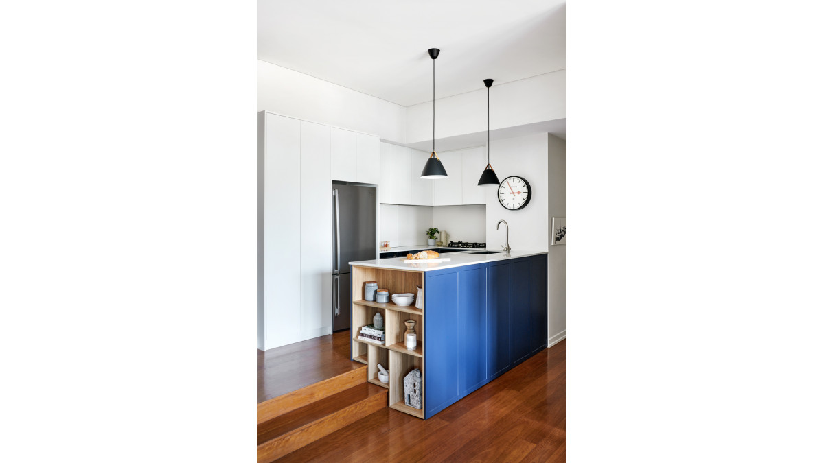
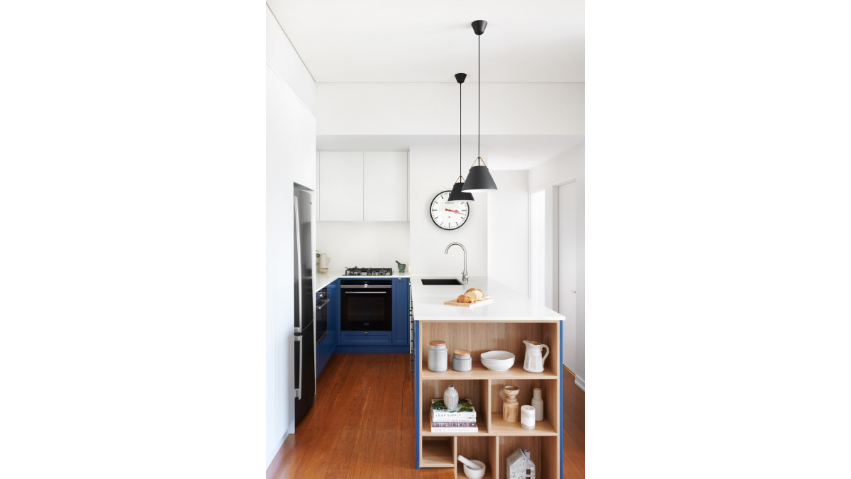
Plan kitchen layouts to make the most functional use of every last millimetre. While this kitchen is just five square metres, the U-shaped layout provides plenty of bench space, storage space and all necessary appliances.
“We had limited remodelling options because of the small size of the space," says Alicia. "The new design followed a very similar footprint but made better use of all the space available by including wall cabinets wherever possible, the addition of shallow tall cabinetry and clever storage solutions."
Maximise storage capacity
The only way is up when it comes to storage in a compact kitchen. Extending overhead cabinets and tall cabinetry to the ceiling or bulkhead will increase storage capacity in a small kitchen and help to keep it ordered and organised.
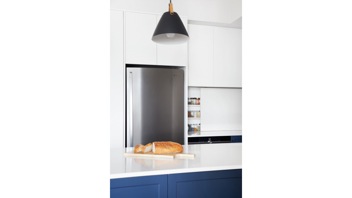
Blakes of Sydney incorporated additional storage into this kitchen with a shallow pantry next to the fridge, a splashback cabinet that slides open to reveal a spice rack, and open shelving at the end of the peninsula bench for displaying objects and books. Trays and storage systems also keep drawers and cupboards well-organised and make utensils, cookware and food much easier to find.
Limit the material palette
Working with a limited material palette will create a more uniform, seamless space, helping it feel larger and more orderly. Aim to utilise three or four materials for the flooring, cabinetry, benchtop and splashback.
This homeowner selected Silestone Calacatta Gold for the benchtop, and Dekton Zenith for the splashback and cupboard joinery. “They loved the vein of the Silestone Calacatta Gold and knew about the fantastic functional qualities of the product. They also loved the neutral colour, texture and matt finish of Dekton Zenith,” says Alicia.
Choose light and bright colours
“The choice of light materials and colours is important in a small kitchen as they can make a space feel larger,” says Alicia. “We selected a light-coloured benchtop, splashback and tall wall cabinets to reflect light and make the space feel brighter and bigger.” Indeed, light colours will help make a small kitchen appear bigger and brighter as they reflect more light than darker surfaces, maximising the impact of natural or artificial light and making a space feel open and airy.
Accent with pops of colour
While light and bright colours help to enhance the sense of space, small doses of vibrant colours or patterns can provide contrast and draw the eye to focal points. Introduce a burst a colour through feature cabinetry — as in the blue base joinery in this kitchen, or by way of small appliances, accessories and textiles.
Minimise hardware
Cupboard door and drawer handles can add to the visual fussiness of a space. Instead choose drawer pulls, cut-outs or a push-opening system to eliminate hardware for a more streamlined space. Ditching the visual details will help trick the eye into thinking it’s a larger space.
Choose compact, complementary appliances
Help clients select proportionately sized appliances that can still do what is required and support the way they live and cook. For example, include a 45-centimetre-wide dishwasher rather than the standard 60 centimetres, or a two-hob cooktop rather than four.
Selecting a suite of appliances from the same brand or range will also create uniformity and continuity within a space and concealing them behind cabinetry will help make the space appear larger. Blakes of Sydney integrated the into overhead cabinets to continue the appearance of streamlined, seamless joinery.
Declutter the kitchen
Decluttering a kitchen is one easy way to make it feel more spacious. Encourage clients to organise their drawers and cupboards to keep items organised, compartmentalised and easy to find, and only have a few pieces on view, such as decorative objects, recipe books, plants or essential items.





 Case Studies






 Popular Products from Cosentino NZ


 Most Popular


 Popular Blog Posts